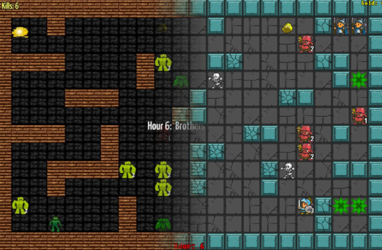
I had a lot of fun last weekend with my game Cardinal Cell.  It was pretty fun in the end but it was ugly enough to make babies cry because I cobbled together the art on my own.  I could have maybe increased the quality another quarter-point on my own before finishing off the 48 hours…  I could have chosen a style.  I could have smoothed out the busy textures.  However, I was focused on closing the book with features-features-features.
I’m pretty confident that it was a mistake on my part…  while I go through other people’s games I constantly have to tell myself to not let an ugly game influence my assessment of its fun… or let a pretty game get away with dull gameplay.  Maybe it’s not fair, but that’s the way the world works.  Those of us with weaker art skills have a challenge to overcome.

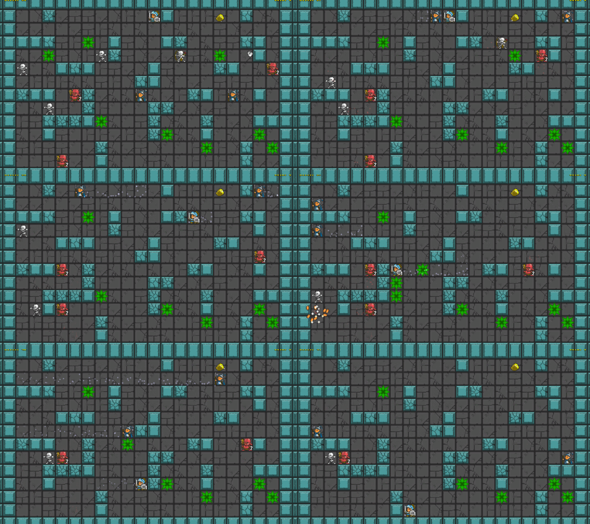
Because the game looked so bad I did a quick reskin this weekend to use some pixel art and audio that I had handy.  I think the gameplay stands well on its own, but the revamp makes a difference in my opinion.  A friend offered up some real art and we’re going to rebrand it as…  wait for it… Skate Knight.
If you’re interested in seeing what a few hours of stock graphics and sounds can do for a game, check out the game on itch.io below.

